SRAC Display
It has been a while since I have put my work together in one location.
So I was very excited to gather my most recent creations for
the Smithfield Recreation and Aquatic Center (SRAC)
Ceramic Display Case.

This is a beautifully made cabinet created by a clay studio artist
to give SRAC ceramic artists a place to share their work!

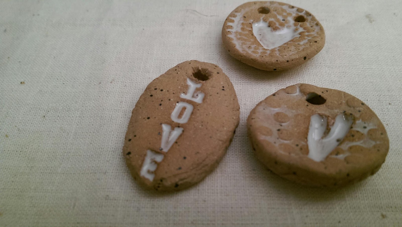
Ceramic angels, crosses, wheel thrown and hand built bowls and baskets.

Ceramic plate, pinch pots, talsmen, necklaces, jewelry and pendants.

Thank you Kristin and the SRAC for this opportunity to share my clay work!